The New York Times
New Treatments for Diabetes
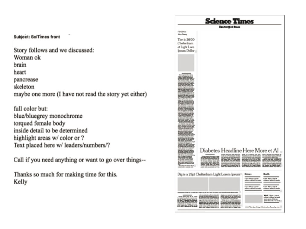
Back in 2007, Kelly Doe of The New York Times called with an assignment for the front-page illustration of the Science Times section. The story was on new treatments for diabetes, and the illustration needed to show what systems of the body are being affected. After our initial call, Kelly followed up with an email that spelled out what needed to be shown, along with a screen grab of the space I would be working with:
At the time, I found doing a full-body illustration a bit daunting; I hadn’t done many, with the exception of Vitruvian-style poses of a male (of course) figure seen head-on, standing ramrod-straight.
I wanted to bring warmth to this illustration, something more contemplative and quiet.
So I pulled out some of my art books, laid them out on my drafting table (I actually have one of those!), and started sketching and scribbling ideas. The sinuousness in the work of the 19th-century painter Jean-Auguste-Dominique Ingres (top right in the photo below) appealed to me, and there was something about his abstraction in line that I had a feeling would translate well into 3D illustration. The fact is, human bodies portrayed in 3D are often, plain and simply, strange. But one of my favorite quotes is by Francis Bacon (the philosopher, not the painter): “There is no excellent beauty that hath no strangeness in the proportion.”
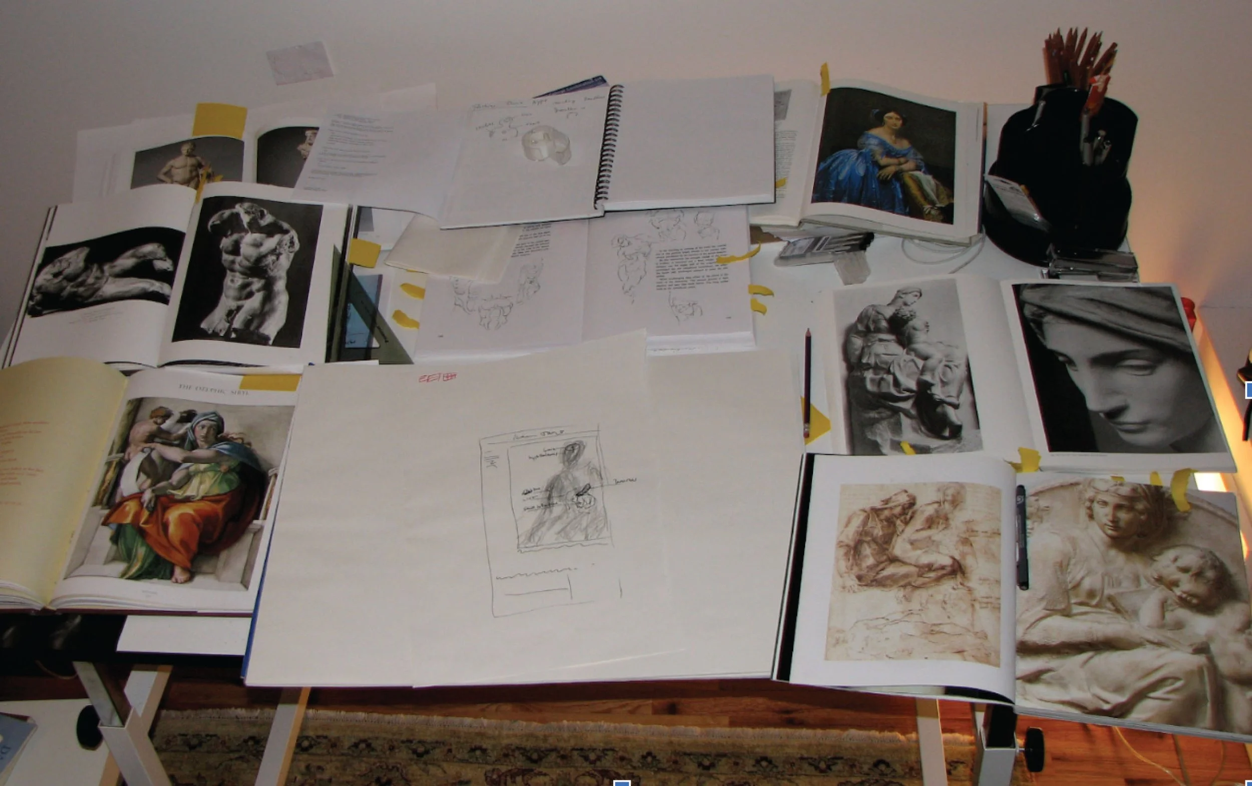
The pencil sketch you see on the table was just for me — scribbling helps me think, much like talking out loud.
I decided to use a sitting position for the figure that I felt had the opportunity for much line expressiveness and design interest. So after coming to some kind of internal vision, I began roughing out poses in the 3D software I work in.
I settled on a couple of poses, roughly drew in the organs that were to be highlighted, and sent a couple of JPGs to Kelly.
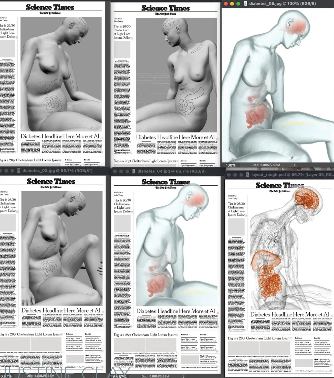
After a little tweaking over the course of a day, we agreed on a pose, and from there I began exploring style and lighting. But something wasn’t working. It was looking a bit too strange and robotlike.
After further discussion, Kelly and I decided I should try doing darker lines on a white background. The rest — while being quite detail-oriented, of course — was rather straightforward.
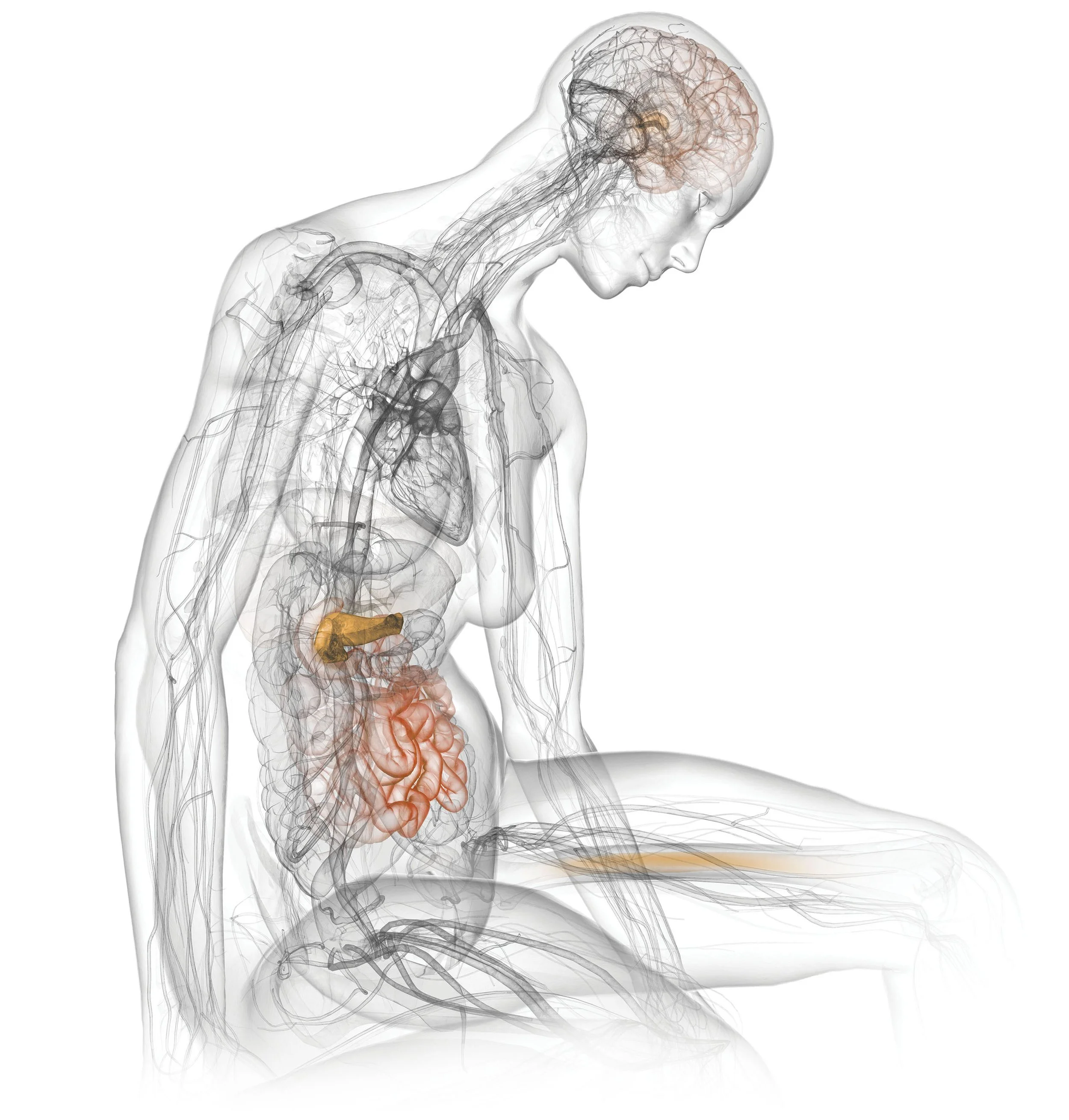
And here is the final piece: